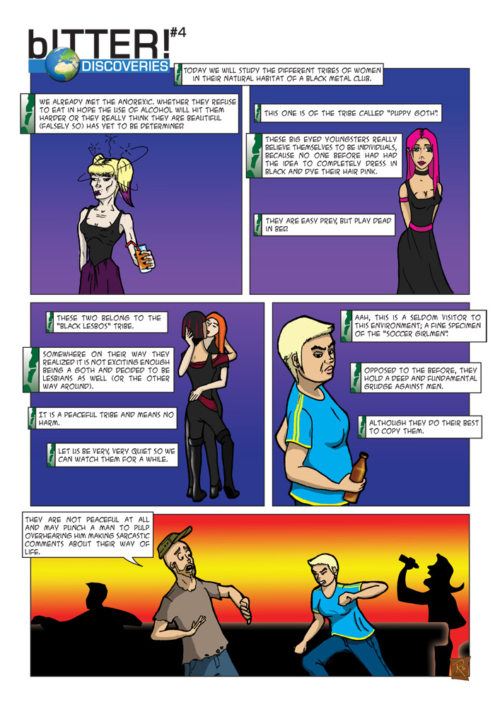
This concludes our visit to the black metal club.
What do you (especially you who know the first version of this episode) think about the exclamation-mark-in-a-box beside the narrator boxes. Good idea? Too much? Any thoughts?
This concludes our visit to the black metal club.
What do you (especially you who know the first version of this episode) think about the exclamation-mark-in-a-box beside the narrator boxes. Good idea? Too much? Any thoughts?
keeping the comics tradition, i’ll answer in english.
I like the exlamation mark left o’ the box. It makes sure the reader knows that this is a voiceover. And it does not disturb the reading flow at all.. so thumbs up.
and as i told u some time ago, i really like this bITTER episode the best so far.
Basti
Thank You.
So I will keep this design for further use.
BTW: There is no need to comment in English. You can use every language you feel comfortable with. I would have a hard time to understand Swahili, though. I would prefer English or German. But any comment is welcome ;)
Ich find´s ohne Ausrufezeichen besser. (wäre mir ganicht aufgefallen dass das welche sein sollen). Die Sprechblasen haben ja den Zippel unten.
Das mal so aus meiner bürgerlichen und garnicht künstlerischen Welt ;-)
OK. Haben wir zwei gegensätzliche Meinungen. Ein Unentschieden also bisher. Noch jemand?
seh ich auch so. der zippel sagt alles! die ausrufezeichen müssen nich. ich würd vielleicht höchstns die schrift kursiv machn oder so was in der art.
Alles klar. Is vermerkt. Allerdings gefällt mir kursive Schrift nicht.
muss ja auch nich. ich sagte ja auch höchstns und meinte damit allerhöchstns.
ich probier es mal auf deutsch. ich habe auch keine ausrufezeichen erkannt, dafür sind die zu abstrakt. mich interessieren diese dinge auch gar nicht, wenn einem die hardcorelesbe direkt ins auge springt. gruselig… warum sind die comics nicht auf deutsch? vielleicht würd ich dann auch mehr lesen und nicht nur bilder angucken. alles in allem find ich die bitter dinger aber großartig. weisste ja.
Ich finds nicht weiter wichtig, ob das Ausrufezeichen als solches erkannt wird. Mein Ziel war ein grafisches Element einzubringen, was optisch die “Erzählerstimme” von den Dialogboxen trennt; über den Zippel hinaus…
Die Comics sind auf englisch, weil ich sie Anfangs (und auch weiterhin) auf internationalen Webseiten veröffenlicht habe.
Ansonsten freuts mich natürlich, daß dir es trotzdem gefällt.
Why exclamation marks? These frames, you should make them golden!
Huh. Good One. Kudos. ;)
I love that violet. Uhaaargh. No, you should have a different background for each category. The design should underline the characterization of each group of female disaster. Thank you. Your Design-Guru-Ashole-Master-Mega-Everyone-Has-To-Follow-Friend.
Thank you for your constructive criticism. And I hereby award you with the medal for being the first “Design-Guru-Ashole-Master-Mega-Everyone-Has-To-Follow-Friend” ever. ;)